Portfolio of Data Visualizations
by Ding Luo
Graduate student | Information Management | University of Washington | Data Science | Business Intelligence | Data Visualization
Highly motivated and goal oriented professional with 2-year experience in business intelligence, data analysis and management consulting, I have a strong background in developing technical and analytical solutions tailored to clients’ needs. My comprehensive skills vary from data retrieval (SQL, Python, Excel), data pipeline development (ETL, SSIS), data modeling and analysis (Python, R) to data visualization and reporting (Tableau, D3.js). Also with a unique educational background in both business and technology, I’m able to partner with both business and engineering teams to provide efficient communications and ad hoc investigation in a dynamic environment.
In this portfolio, I included eight visualizations I created in my projects or internships either in D3.js , Tableau or Python.
The topics include:
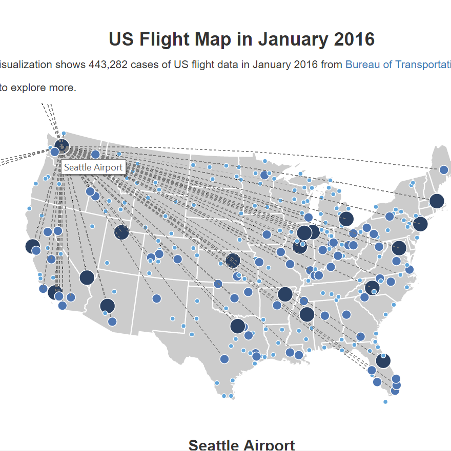
US Flight Map Vis (D3.js),
Twitter Sentiment Analysis (D3.js),
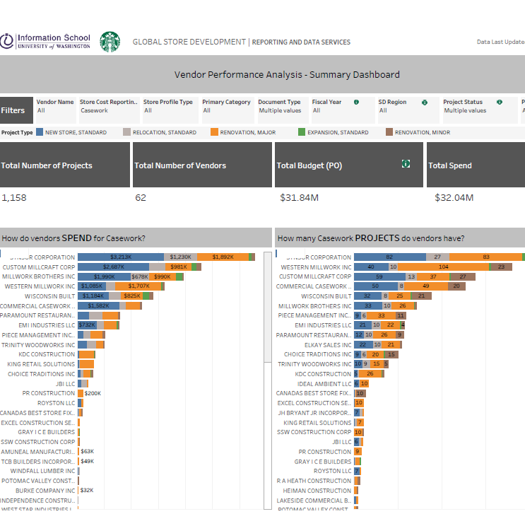
Starbucks Vendor Performance Analysis (Tableau),
Offline Grocery Store Density Map (Google Map API, Python),
Product Analysis (Tableau),
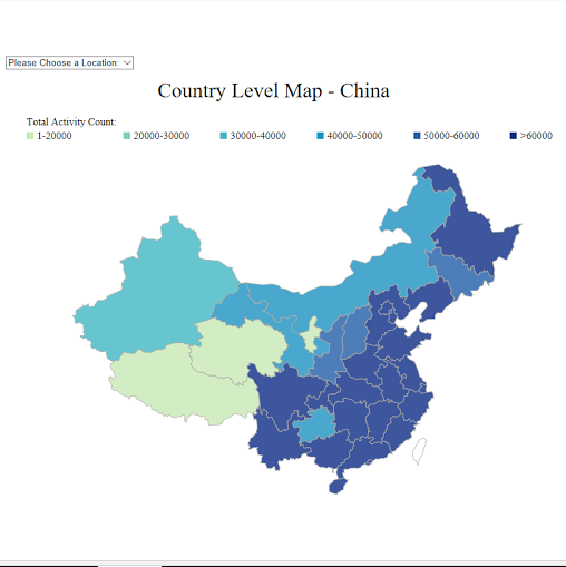
China Map Vis on Mobility Data (D3.js),
Vaccine Data Vis (Tableau) and
Survey Data Vis Design (Tableau).

Twitter Sentiment Analysis
Starbucks Vendor Performance Analysis

offline grocery density map
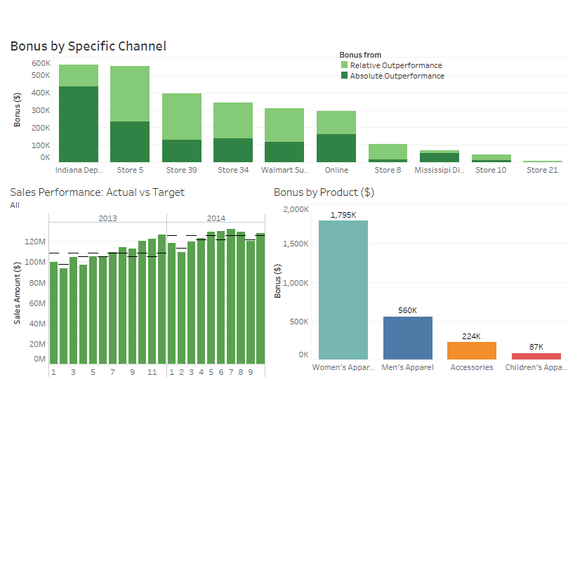
Product Analysis
China Map Visualization on Mobility Data
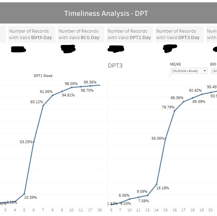
Vaccine Data Vis
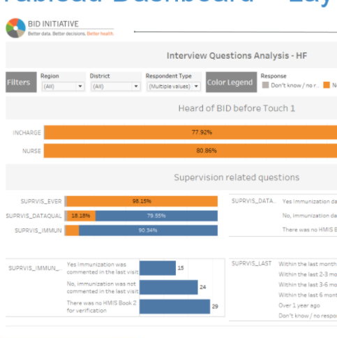
Survey Data Visualization Design
Internship Story

Resume

TBD