Vaccine Data Visualization
 As a data analyst intern at PATH (a global health organization),
I helped our team evaluate the outcome of our digital
immunization system in two African countries.
As a data analyst intern at PATH (a global health organization),
I helped our team evaluate the outcome of our digital
immunization system in two African countries.
One of the data I dealt with was about vaccine data.
We have data for all the children in several districts including their birthday, gender and time when they
received certain type of vaccine. Then we need to visualize these data to analyze how many children got their
vaccines in time (timeliness analysis).
However, the recommended immunization schedules (either by week or day or month)
vary from one vaccine to another. We need to visualize the results by
vaccine type.
Then we used Tableau to visualize our results, which could be easily shared through the whole organization
in different countries by Tableau server.
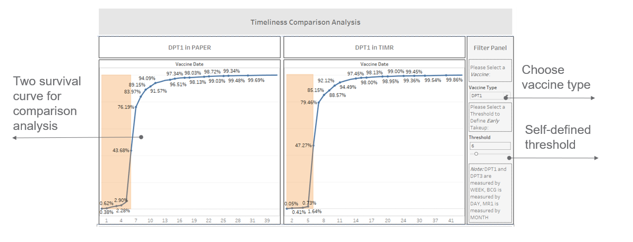
Here is one dashboard I created in Tableau for DPT1 Vaccine:
Vaccine Timeliness Analysis
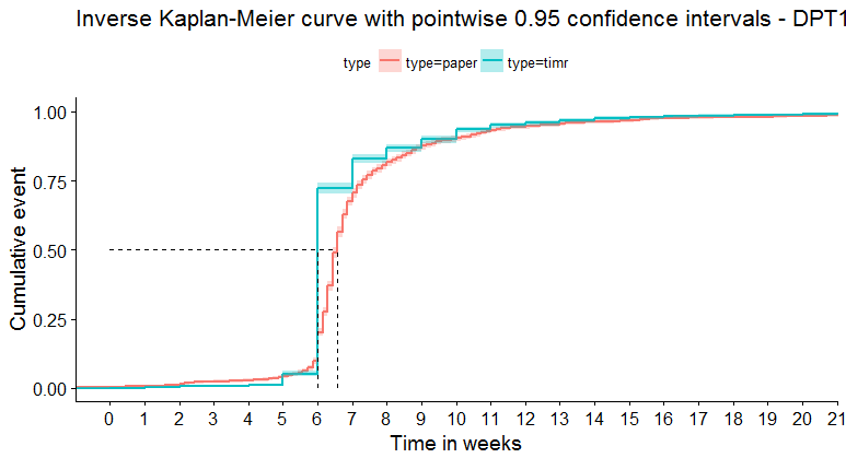
In addition to visualization, we also want to quantify the timeliness results of different types of vaccine using survival analysis. In this part, I used three methods: Survival Difference Analysis, Cox Regression Analysis and Inverse Kaplan-Meier Curve . Here is the example of an inverse kaplan-meier curve for DPT1.
 The result of this part is written in a paper in progress.